Written by the Softwarestech Design Team — reviewed by Lead product designers. Last updated: June 2026.
We’ve sat in enough “why did our conversion rate drop after the redesign” meetings to know that good UI/UX design principles aren’t a nice-to-have layer you add at the end. We’ve audited checkout flows that lost 18% of revenue to a single confusing form field, and onboarding screens that quietly drove away half of new signups in the first 90 seconds. This article walks through what actually moves the needle in 2026, based on projects we’ve shipped and the mistakes we’ve fixed.
On This Page
- Why “Make It Pretty” Was Never the Job
- Core Usability Principles That Still Decide Outcomes
- Mapping the User Journey Before You Redesign Anything
- Design Systems: Consistency, Speed, and Testing at Scale
- Mobile-First Design as a Conversion Factor
- Micro-Interactions and Motion
- Accessibility: A Conversion Issue, Not Just a Compliance One
- AI in UX: Research, Variants, and Where Humans Still Matter
- Usability Testing: Choosing the Right Method
- UX Principles and Where They Hit Conversion
- Two Redesigns That Moved the Numbers
- Frequently Asked Questions

Key Takeaways
- Friction kills conversions before aesthetics ever get a chance to. Most drop-off happens at specific, fixable points in a flow — not because the design “isn’t pretty enough.”
- Core usability principles still decide outcomes. Clarity, feedback, consistency, and forgiveness explain why some interfaces feel effortless and others feel like a chore.
- Design systems pay for themselves through testing speed. Teams with mature design systems ship A/B tests in days instead of weeks.
- Mobile-first isn’t a checkbox anymore. For most B2C products, mobile traffic now drives the majority of conversions, and the mobile experience often determines the desktop one too.
- Micro-interactions help only when they confirm or guide — never when they delay. A 300ms animation can build trust; a 1.2-second one can cost you a sale.
- Accessibility is now a revenue and legal issue. WCAG 2.2 compliance affects search visibility, market reach, and exposure to ADA-related litigation.
- AI speeds up research and variant generation, but human judgment still decides what ships. Teams that blend both move faster without losing the plot on what users actually need.
Why “Make It Pretty” Was Never the Job
Every few months, a founder shows us a beautifully designed app with a conversion rate that’s been flat for a year. The visuals are clean, the color palette is on-brand, the typography is carefully chosen. And yet people land on the signup page and leave.
The problem is almost never the paint job. It’s friction — the small, cumulative obstacles that make a user pause, hesitate, or give up. A field that doesn’t explain why you need a phone number. A “Continue” button that looks disabled when it isn’t. A pricing page that requires three clicks to find the actual price. None of these are aesthetic problems, but all of them show up as a worse-looking product because users associate confusion with low quality, even when the visual design is fine.
This is the core idea behind UI UX design principles 2026: design is a system of decisions that either reduces or adds friction at every step of a user’s journey, and conversion rate is essentially a measurement of how much friction you’ve left in. When we talk to clients about a redesign, the first question we ask isn’t “what should this look like?” It’s “where, specifically, are people dropping off, and why?” Often the honest answer to “why” is some version of “we never asked the user what they were trying to do.”
A useful mental model: every screen has a job. The job of a signup screen is to get a qualified user to create an account with the least possible doubt. The job of a checkout screen is to get someone who has already decided to buy across the finish line without giving them a reason to reconsider. When you start from “what is this screen’s job, and what’s getting in its way,” design decisions get a lot more concrete — and a lot less subjective.

Core Usability Principles That Still Decide Outcomes
Usability heuristics aren’t new — some of them trace back to Jakob Nielsen’s work in the 1990s, and the Nielsen Norman Group still publishes some of the best research on the subject — but they’re more relevant in 2026 than ever, mostly because interfaces have gotten more complex (more integrations, more personalization, more AI features competing for screen space). Four principles come up constantly in our audits.
Wireframe the flow first
Map the user journey
Build a design system
Prototype before you build
Clarity
Can a first-time user tell, within about three seconds, what this screen wants them to do? If the answer requires scanning the whole page, clarity has failed. We worked with a fintech client whose dashboard had four call-to-action buttons of nearly identical visual weight. Users didn’t know which one mattered, so most did nothing. Reducing it to one primary action and three secondary links (visually de-emphasized) increased the target action’s completion rate by 27% — without changing a single word of copy.
Feedback
Every action needs a visible, immediate response. Click a button and nothing happens for two seconds? Users click again, sometimes triggering duplicate submissions (we’ve seen this cause duplicate orders in e-commerce checkouts more than once). A loading spinner, a disabled-state change, a subtle color shift — any of these tells the user “the system heard you.” This matters even more now that many actions trigger AI processing in the background, which can take a few seconds longer than a traditional database write.
Consistency
If “Save” is a blue button on one screen and a green button on another, users have to relearn your interface every time they move between sections. Consistency isn’t about being boring — it’s about letting users build muscle memory so they can focus on their task instead of your UI. This is also where design systems earn their keep, which we’ll get to shortly.
Forgiveness
Good design assumes people will make mistakes and gives them an easy way out. Can they undo a delete? Edit an order before it ships? Go back a step in a multi-page form without losing what they typed? A logistics client we worked with had a quote request form that cleared all fields if a user clicked “back” by accident. Adding simple local-storage persistence (so the form remembered entries) cut form abandonment on that page by close to a third.
Pro Tip
Before you redesign anything, run a five-minute “three-second test” on your highest-traffic screen: show it to five people who’ve never seen it, give them three seconds, then ask what they think the page wants them to do. If you get five different answers, you have a clarity problem — and it’s almost always cheaper to fix than the team expects.
Mapping the User Journey Before You Redesign Anything
One of the most common mistakes we see is teams jumping straight to “let’s redesign the homepage” without first mapping where users actually struggle. A redesign based on opinions instead of data tends to move the friction around rather than removing it.
A proper user journey map starts with the data you already have: analytics funnels, session recordings (tools like Hotjar, FullStory, or Microsoft Clarity are common choices), support tickets, and search queries on your own site. You’re looking for patterns — places where a large percentage of users enter a step but don’t complete it, or where the same question shows up repeatedly in support.
From there, you map the journey stage by stage: awareness, consideration, signup/purchase, onboarding, and ongoing use. At each stage, note the user’s goal, their emotional state (confused? confident? anxious about cost?), and what the interface currently does — or fails to do — to support that goal. This sounds like a lot of process for what might end up being a small fix, but it’s the difference between redesigning a screen that loses 2% of users versus the screen that’s actually losing 35%.
We typically combine this with a lightweight heuristic review against established usability principles before touching any visual design. It’s far cheaper to fix a flow on a whiteboard than to redesign it, ship it, and discover the same drop-off six weeks later.

Design Systems: Consistency, Speed, and Testing at Scale
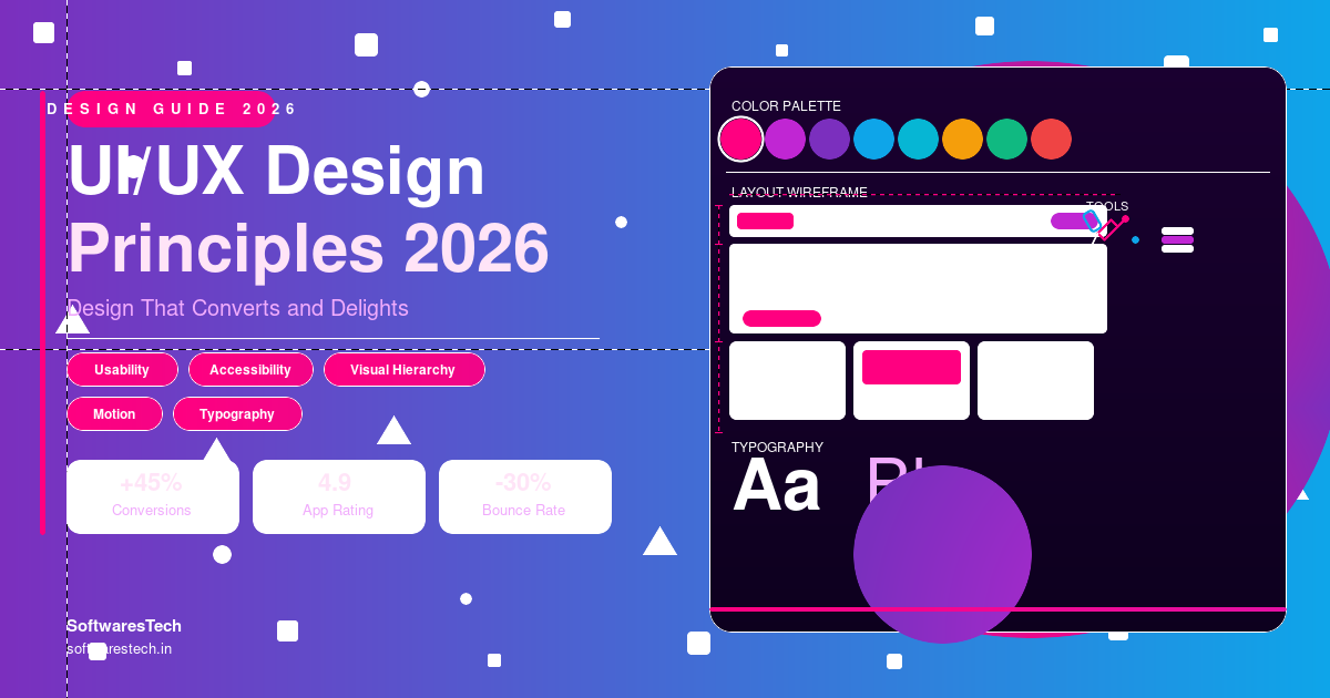
If you’re running more than a handful of A/B tests a year, or if your product has more than two or three people touching the UI, a design system stops being optional. A design system is a shared library of components (buttons, forms, modals, navigation patterns), design tokens (colors, spacing, type scales), and usage rules that everyone — designers and engineers — pulls from.
The conversion connection is less obvious than it sounds, but it’s real. When every button, form field, and modal is built from the same component library, testing a new checkout flow doesn’t mean redesigning checkout from scratch — it means rearranging existing, already-validated components. We’ve seen teams go from a 3-week turnaround on a single A/B test variant to under a week, simply because the design and engineering teams stopped rebuilding the same dropdown component slightly differently every time.
Design systems also reduce the “death by a thousand inconsistencies” problem. A checkout page built by one team and an account settings page built by another, six months apart, often end up with subtly different spacing, button styles, and error message tones. Individually, none of these differences tip a user toward leaving. Collectively, they signal “this product wasn’t built carefully,” which erodes trust — and trust is one of the biggest unspoken factors in conversion, especially for anything involving payment information.
Tools like Figma (with its variables and component libraries), Storybook for documenting live components, and token-based systems that sync design and code (such as Style Dictionary) have made this much more achievable for small and mid-sized teams than it was even three or four years ago. If your team is earlier in its product journey, our guide to the modern software development lifecycle covers where design systems fit into a broader delivery process.
Mobile-First Design as a Conversion Factor
“Mobile-first” used to mean “make sure the mobile version doesn’t look broken.” In 2026, for most consumer-facing products, mobile is often the primary surface, not a secondary one — and for many B2B products, it’s where a meaningful share of initial research and signup happens, even if the core work happens on desktop later. If you want the fuller picture of how mobile platforms are evolving, our mobile app development guide for 2026 goes deeper into platform-specific considerations.
The conversion implications go beyond responsive layouts. Mobile users are more likely to be distracted, on a slower connection, and using one thumb. That changes what “good design” means in practice:
- Tap targets need real space. Apple and Google’s guidelines both recommend roughly 44-48px minimum touch targets — anything smaller causes mis-taps, which on a checkout form means re-entering a credit card number, which means a chance to abandon.
- Forms need to use the right input types. A phone number field that doesn’t trigger the numeric keypad, or an email field without the “@” key visible, adds friction that desktop users never notice.
- Page weight affects perceived trust, not just speed. A checkout page that takes 4+ seconds to load on a mid-range Android device on 4G doesn’t just frustrate users — it makes the brand feel less credible.
One subtlety worth calling out: designing mobile-first often produces a better desktop experience too, because it forces you to prioritize. When you can’t fit six navigation items and three CTAs on a small screen, you’re forced to decide what actually matters — and that same prioritization usually improves the desktop layout as well. This connects closely to broader web development trends for 2026, where performance and mobile experience are increasingly treated as the same problem.
Micro-Interactions and Motion: When They Help and When They Hurt
A well-placed micro-interaction — a button that subtly depresses on click, a checkmark animation when a form field validates successfully, a gentle shake on an incorrect password — can make an interface feel responsive and trustworthy. These small moments of feedback reduce the anxiety of “did that work?” which is exactly the kind of doubt that causes people to abandon a flow.
But motion design has a cost, and it’s easy to overspend. We reviewed a travel booking site last year where every step transition included a 600ms slide-and-fade animation. Individually, it looked polished in a demo. In practice, a five-step booking flow added up to three full seconds of pure animation time with zero functional value — and on slower devices, the animations occasionally stuttered, which felt worse than no animation at all.
The rule of thumb we use: micro-interactions should confirm something happened or guide attention to what happens next — never just “look nice.” If removing an animation wouldn’t make the interface harder to understand, it’s probably costing you more in perceived speed than it’s giving you in polish. Anything load-bearing for usability (loading states, success/error confirmation, focus indicators) should stay near-instant — under 200ms is a good ceiling for most transitions.
Common Pitfall
Adding decorative motion to every state change “because it looks more premium.” Teams rarely test animation timing on a mid-range Android phone over 4G — the device most of their actual users are on. If a transition would feel sluggish on a three-year-old phone with a weak signal, it’ll feel sluggish in production, no matter how smooth it looked on the design lead’s laptop.
Accessibility: A Conversion Issue, Not Just a Compliance One
Accessibility tends to get filed under “legal requirement we’ll deal with eventually,” but treating WCAG (Web Content Accessibility Guidelines) compliance as purely a legal checkbox misses how much overlap there is between accessible design and good design generally. The W3C Web Accessibility Initiative publishes the standards most audits are measured against, and they’re worth bookmarking even if you never read them cover to cover.
Consider color contrast. WCAG 2.2 AA requires a contrast ratio of at least 4.5:1 for normal text. Low-contrast text doesn’t just fail an audit — it’s harder to read for everyone in bright sunlight, on a low-quality screen, or for the roughly 8% of men with some form of color vision deficiency. Fixing contrast issues across a site often improves readability metrics for the entire user base, not just users with disabilities.
Then there’s the legal and market reality. ADA-related website lawsuits in the US have continued to climb year over year, and the EU’s Web Accessibility Directive and the broader European Accessibility Act (which became enforceable for many private-sector digital products and services in mid-2025) mean accessibility is now a market-access requirement for anyone selling into the EU, not an optional extra. For B2B software selling to government or enterprise clients, WCAG 2.1 AA or 2.2 AA compliance is increasingly a line item in procurement requirements — fail it, and you’re disqualified before pricing even comes up.
Practical starting points that catch the majority of issues: ensure every interactive element is reachable and operable via keyboard alone, add meaningful alt text to images (not just “image123.jpg”), make sure form fields have associated labels (not just placeholder text, which disappears once a user starts typing), and test with a screen reader at least once per major release. None of this requires a redesign — most of it is implementation discipline that a design system, done right, enforces automatically.
AI in UX: Research, Variants, and Where Humans Still Matter
AI has changed UX work meaningfully over the past two years, mostly in two areas: research synthesis and design variant generation.
AI-assisted research
If you’ve ever tried to manually read through 400 open-ended survey responses or a few hundred support tickets looking for patterns, you know how much time that takes — and how easy it is to miss a recurring theme buried in the noise. AI tools (including general-purpose LLMs and specialized research platforms) can now cluster feedback by theme, surface sentiment trends, and summarize session recordings at a scale that simply wasn’t practical for a small team before. We’ve used this to process months of customer feedback for a client in a few hours, surfacing a recurring complaint about a specific settings page that hadn’t shown up clearly in the analytics because it was phrased differently every time.
AI-generated design variants
Tools integrated into Figma and standalone AI design tools can now generate multiple layout variants of a screen — different button placements, copy variations, layout densities — in minutes rather than days. This is genuinely useful for early-stage exploration and for generating A/B test variants faster.
Where human judgment still matters
Here’s the catch: AI-generated variants are good at producing plausible-looking options, but they don’t know your users, your brand voice, or the business context behind a decision. We’ve seen AI suggest “simplifications” that removed a legally required disclosure, or design variants that looked sleek but ignored an accessibility requirement entirely. The pattern that works best is using AI to widen the funnel of options quickly, then having an experienced designer narrow it down based on context AI doesn’t have. If you’re exploring how AI fits into your broader product and engineering strategy, our piece on how artificial intelligence is transforming modern businesses in 2026 covers the bigger picture beyond design specifically.
Usability Testing: Choosing the Right Method
Not every design decision needs a six-week research study, but very few high-stakes decisions should ship without any validation at all. The three most common methods, and when we reach for each:
Moderated usability testing
A facilitator watches a small number of users (5-8 is often enough to surface major issues) attempt tasks in real time, asking follow-up questions as they go. This is best for early-stage concepts, complex workflows, or anything where you need to understand why someone struggled, not just that they struggled. It’s slower and more expensive per session but yields the richest insight.
Unmoderated remote testing
Tools like Maze, UserTesting, or Lookback let users complete tasks on their own time while the tool records their screen, clicks, and (often) think-aloud commentary. This scales better — you can get 20-30 sessions in the time a moderated study gets 5 — and works well for testing a near-final design against specific tasks (“find the pricing page and start a trial”).
A/B testing
Once you have enough traffic (a rough rule of thumb: enough conversions per variant per week to reach statistical significance within a reasonable timeframe — often a few hundred conversions per arm at minimum), A/B testing tells you what actually happens with real users at scale, not what people say they’d do. The trade-off is that A/B tests tell you what won, not why — which is why it pairs well with the qualitative methods above rather than replacing them.
A reasonable sequence for a meaningful redesign: moderated testing on early concepts to catch major usability problems cheaply, unmoderated testing on a near-final design to validate task completion, then A/B testing the winner against the current version to confirm the impact before a full rollout.
Quick Checklist: Before You Ship a Redesign
- ✓Pulled funnel analytics and session recordings to find the actual drop-off points, not assumed ones
- ✓Confirmed every screen has one clear primary action, with secondary actions visually de-emphasized
- ✓Checked tap targets, input types, and mobile load time on a mid-range device over 4G
- ✓Ran a contrast check and keyboard-navigation pass against WCAG 2.2 AA
- ✓Tested the new flow with at least 5 real users before wide rollout
- ✓Reviewed any AI-generated variants for accessibility and legal/compliance issues before shipping
- ✓Set up an A/B test (or at minimum a before/after comparison) so you can prove the impact
UX Principles, Practical Meaning, and Where They Hit Conversion
The table below maps common UX principles to what they actually look like in implementation, and which part of a typical funnel they tend to affect most.
| UX Principle | What It Means in Practice | Typical Conversion Impact Area |
|---|---|---|
| Clarity / single primary action | One visually dominant CTA per screen; secondary actions de-emphasized | Signup, lead generation forms |
| Progressive disclosure | Showing only the fields/options needed for the current step, revealing more as needed | Multi-step checkout, account setup |
| Immediate feedback | Loading states, inline validation, confirmation messages within ~200ms | Checkout, payment forms |
| Forgiveness / easy recovery | Undo actions, persistent form data, clear back navigation | Forms, account/profile management |
| Consistency via design systems | Shared components and tokens across all pages and teams | Site-wide trust, repeat usage |
| Mobile-first layout | Touch-friendly targets, correct input types, prioritized content | Mobile checkout, app onboarding |
| Accessible contrast and labeling | WCAG 2.2 AA contrast ratios, keyboard navigation, screen reader support | Navigation, forms, legal/compliance risk |
| Purposeful micro-interactions | Animations under ~200ms that confirm actions, not decorate them | Form submission, cart/checkout actions |
Two Redesigns That Moved the Numbers
A SaaS Onboarding Flow That Cut Drop-Off Nearly in Half
A mid-sized project management SaaS company we worked with had a healthy signup rate but a brutal onboarding funnel: only about 40% of new accounts ever created their first project, and fewer still invited a teammate — the action most correlated with long-term retention.
The original onboarding asked new users to configure eleven settings before they could see the product: workspace name, team size, industry, notification preferences, integrations, and more. Session recordings showed people getting stuck on questions they didn’t have answers to yet (“how many team members will use this?” — for someone who hasn’t even tried the product).
We restructured onboarding around progressive disclosure: get the user into a pre-populated sample project within the first 60 seconds, with sensible defaults for everything else, and surface the remaining configuration options contextually as the user actually needed them (e.g., asking about integrations only when the user clicked “connect a tool”). We also added a persistent, dismissible checklist showing onboarding progress rather than forcing a linear wizard.
The result: first-project creation went from roughly 40% to 71% of new signups within the first session, and the teammate-invite rate — the strongest predictor of retention in this product — increased by about 35% over the following two months. Nothing about the visual design changed dramatically; the win came almost entirely from removing decisions the user wasn’t ready to make yet.
An E-Commerce Checkout Redesign That Reduced Cart Abandonment
An e-commerce client selling home goods had a cart abandonment rate hovering around 74% — not unusual for the industry, but higher than their category benchmarks suggested it should be. Their checkout was a single long page with account creation required before payment, no progress indicator, and a shipping cost that only appeared after entering a full address.
The audit found a few specific friction points: the mandatory account creation step was causing measurable drop-off (visible in funnel analytics as a sharp step-down before any payment fields were even shown), the lack of upfront shipping cost information led to “surprise cost” abandonment at the final step, and the mobile checkout’s submit button sat below the fold on most phone screens, requiring a scroll that a meaningful share of users apparently never made.
The redesign introduced guest checkout as the default (with optional account creation after purchase), added an estimated shipping cost based on postal code early in the flow, broke the single long page into three short steps with a visible progress indicator, and made sure the primary CTA was always visible without scrolling on mobile. Cart abandonment dropped from 74% to about 61% over the following quarter — a meaningful recovery of revenue that had simply been leaking out through avoidable friction. None of these changes required new functionality; they were entirely about removing obstacles between “added to cart” and “paid.”
Both of these examples follow the same underlying pattern: the fix wasn’t a visual overhaul, it was the removal of friction that had been invisible until someone mapped the journey and watched real users hit it.

If there’s one thing both projects prove, it’s that applying solid UI UX design principles 2026 teams can act on doesn’t require a ground-up rebuild. It requires finding where the friction actually lives, fixing that specific thing, and measuring whether it worked. Pretty matters less than people think. Working matters more than people remember.
Frequently Asked Questions
What’s the difference between UI design and UX design?
UI (user interface) design focuses on the visual and interactive elements — buttons, layouts, typography, color. UX (user experience) design focuses on the overall journey and how it feels to accomplish a goal, including information architecture, flow, and usability. In practice, the two are deeply connected: a beautiful UI built on a confusing flow will still convert poorly, and a well-structured flow with a rough UI will underperform its potential.
How much does a UX redesign typically cost?
It depends heavily on scope. A focused audit and redesign of a single critical flow (like checkout or onboarding) for a small-to-mid-sized product might run from a few thousand to the low tens of thousands of dollars, depending on research depth and number of iterations. A full product redesign with a new design system is a larger investment, but it’s also a different kind of project — one that pays off across every future feature, not just the screens redesigned today.
How do I know if my conversion problem is a UX problem or a marketing problem?
Look at where in the funnel the drop-off happens. If people are arriving (via ads, organic search, referrals) but leaving quickly without engaging, that can point to a mismatch between marketing promises and the landing experience — partly a UX issue. If people engage, start a key task (like checkout or signup), and abandon partway through, that’s almost always a UX/friction problem rather than a marketing one. Funnel analytics combined with session recordings usually make this distinction clear within a week or two of investigation.
Do small businesses really need a design system?
Not necessarily a full enterprise-grade system on day one, but even a small, lightweight component library (a shared set of buttons, form fields, and spacing rules in Figma and code) pays off faster than most small teams expect — usually within the first two or three feature releases, once you start noticing how much time is spent rebuilding the same components slightly differently each time.
How long does it take to see results from a UX redesign?
For a focused flow redesign (onboarding, checkout, a specific form), you can often see measurable changes in conversion metrics within 2-4 weeks of launch, assuming you have enough traffic to reach statistical significance. Larger redesigns involving a new design system or multiple flows typically take longer to plan and build, but the measurement timeline for each individual change is similar once it ships.
Is accessibility expensive to add after the fact?
Retrofitting accessibility is more expensive than designing for it from the start, mainly because issues like missing semantic structure or inconsistent labeling tend to be spread across an entire codebase rather than isolated to one screen. That said, an accessibility audit followed by prioritized fixes (starting with keyboard navigation, contrast, and form labeling — the issues that affect the most users and carry the highest legal risk) is a reasonable and common approach for products built without accessibility in mind originally.
Further Reading
What’s the single highest-leverage UX fix for most teams in 2026?
If we had to pick one: map your top three funnels (signup, checkout/conversion, and onboarding) against real session data and fix the single biggest drop-off point in each before touching anything else. It’s rarely glamorous work, but applying the right UI UX design principles 2026 teams rely on at exactly the points where people are actually leaving tends to produce the largest single jump in conversion for the least effort.

Ready to Turn Your UX Into a Conversion Engine?
From journey mapping and usability audits to full design systems and conversion-focused redesigns, our UI/UX team helps you find — and fix — the friction that’s costing you customers. Explore our UI/UX design services or see how we’ve helped other businesses in our case studies.
Talk to Our Design TeamNeed Help Building Your Next Digital Product?
From web and mobile apps to cloud infrastructure and AI-powered platforms — our engineers can help you plan, build and scale with confidence.